The mapping tool we've been using with most of our clients
At duckworth.design we’ve recently been supporting a lot of organisations large and small to map out and understand where they are and where they want to get to.
With some of these organisations, it’s not for a lack of understanding or insight into problems. It’s the clarity of what to do about those problems.
1 of the teams we’re working with have done 5 years worth of research. But they’ve struggled to make an impact in that area.
There is no single reason for that lack of change. We’re talking about systems and organisations that are very complex.
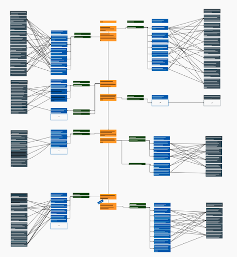
However, a technique that we’ve used quite a bit to help sort out our own thoughts, and structure how these organisations respond and plot what to do next is by using a type of impact mapping.
I’d like to say we have a snappy name. We don’t. It’s sort of a “problem to solution” impact mapping process.
We’ve written it up in our playbook how to follow it. But effectively it’s about following a chain of questions and generating answers to them. Which, with understanding of your users and context, will help you create a visual thread of the problem you’re seeing, who it impacts, how you’d know you’re improving the issue and what you’re going to do to make that improvement happen.

You can do it on your own, in small or large groups. Though it does need a strong sense of your users and their needs. Or the acceptance that you’re working on assumptions that’ll need to be proven. To stop it being a guess.
To go through the process, run through each column to generate and discuss:
- Statement of what’s happening today
- The users impacted by that (internal, external etc)
- The issues caused by what’s happening today for that user (these may overlap)
- Write statements that explain the positive change or impact you’d see that would come about from a change. For example, spending less time managing help desk requests resetting login details
- Then for each positive change, generate the many things you could do to make that positive change happen. This could be many things and things that might conflict with each other. That’s okay. You can prioritise or explore desirability and feasibility later
What we like about it is how clear it makes moving from a problem statement to solutions. It also ensures that the thread is easy to understand, challenge and prove (or not!). It also helps teams who have some people who are better at solutions and those at identifying needs work together. And link up their thinking.
It enables organisations to reflect on the multiple issues being caused by how things work today, as well the multiple actions they could or need to take to resolve issues.
For start ups we use a similar model, but focus the “what’s happening today” with a goal, mission or future vision they want to be part of. Rather than a more traditional problem statement.
This flavour of impact mapping tool has really helped shape the strategy for large organisations and small. And done so where the thread from insights of today can drive the solutions being worked on next.
Want a bit more detail about how to use it? Find that advice in our playbook.
If you want us to help shape your product or service’s strategy and future? Get in touch through our form or by email